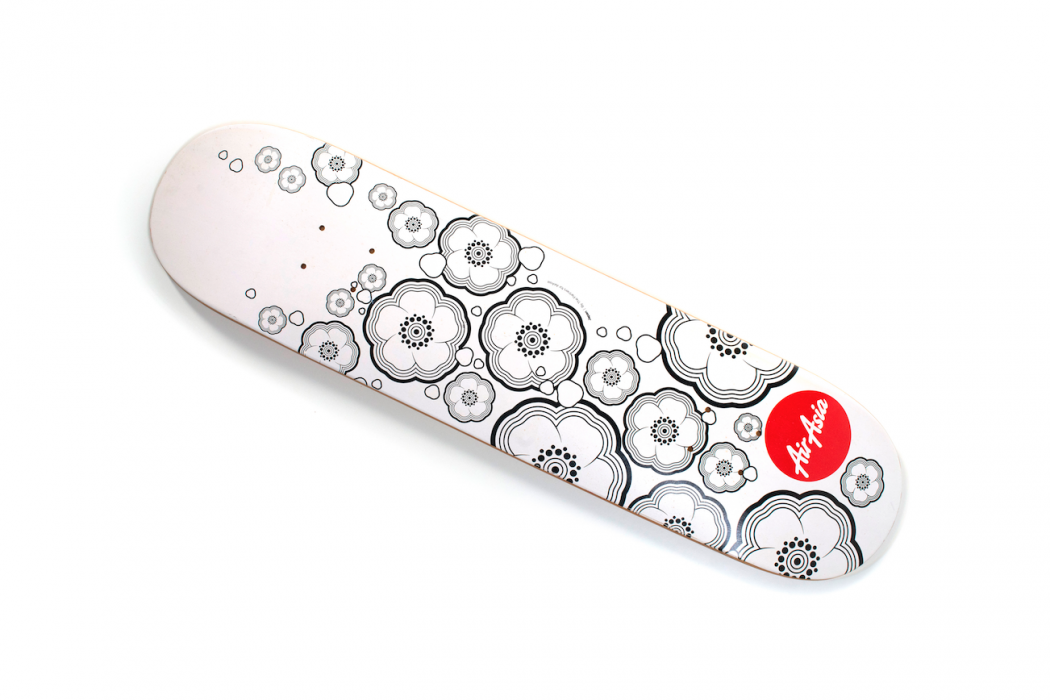
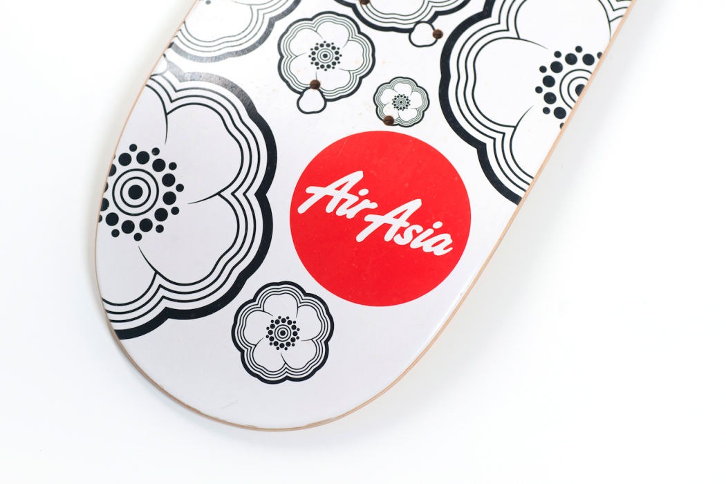
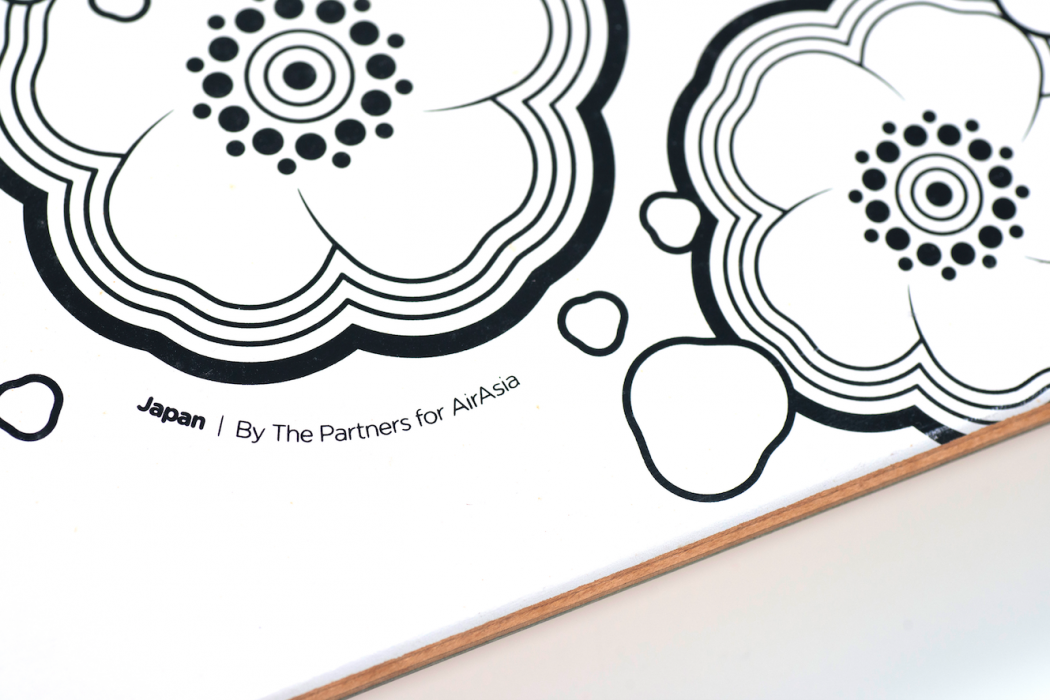
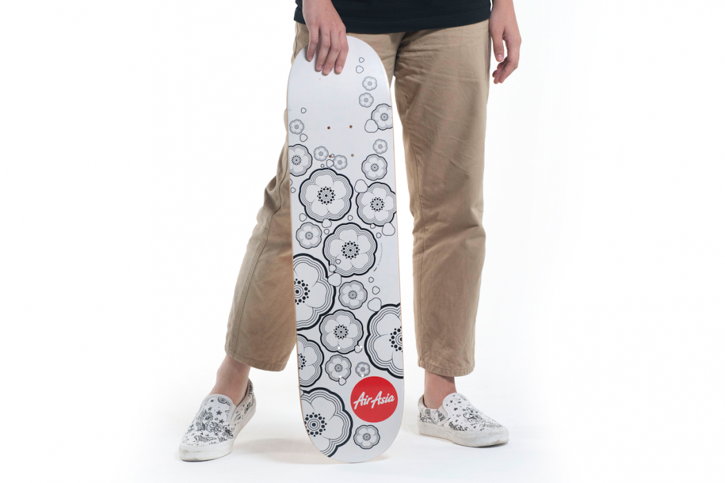
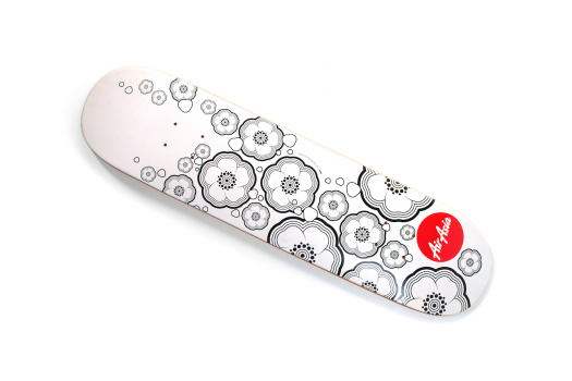
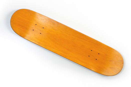
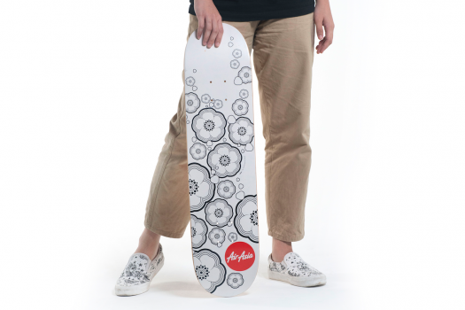
Back in our 10th anniversary in 2012, we partnered up with UK-based agency The Partners to refresh our brand identity. From the exercise, the iconic red circle to house the AirAsia wordmark was born. The rebrand lineup also produced variations of unique black and white graphic prints as as a nod to our spirit of championing Asean and the Asia Pacific destinations that we operate in – from seashells of Bali to the sakura blossoms of Japan. The print was translated onto this limited edition skate deck.
