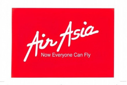
Our original wordmark logo was created in a special font. This was used when we first introduced a “new” AirAsia as a low fares no-frills airline.
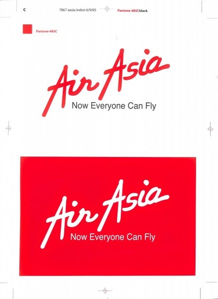
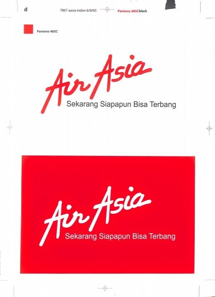
“Now Everyone Can Fly” became a natural tagline for us. Tony and the team went from meetings to meetings explaining how our low fares will open up the flying market so that everyone can fly.
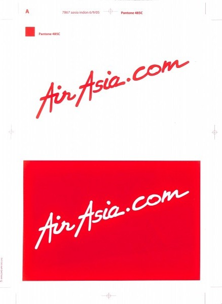
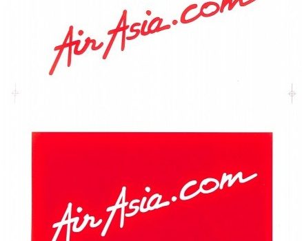
At the time of the dotcom era, we added a pronounced ‘.com’ to the logo and this was used on the plane fuselage. AirAsia’s first website achieved an instant 40% growth that defined the meaning of e-commerce.
Then, the lowest fares were made available only on the website – even in markets where internet and credit card penetration were low, people found a way to book online! Another reason we had to promote the obvious (you might think…) was to ensure people were booking on the legitimate AirAsia website.
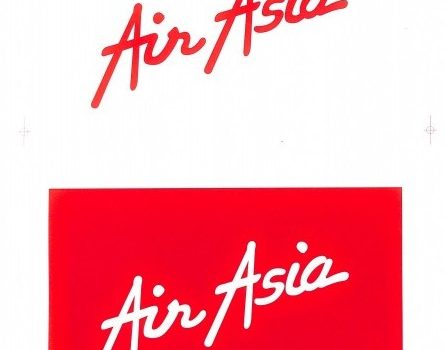
To increase visibility and instant recognition, we alternated the logo on a red background when the situation called for it.