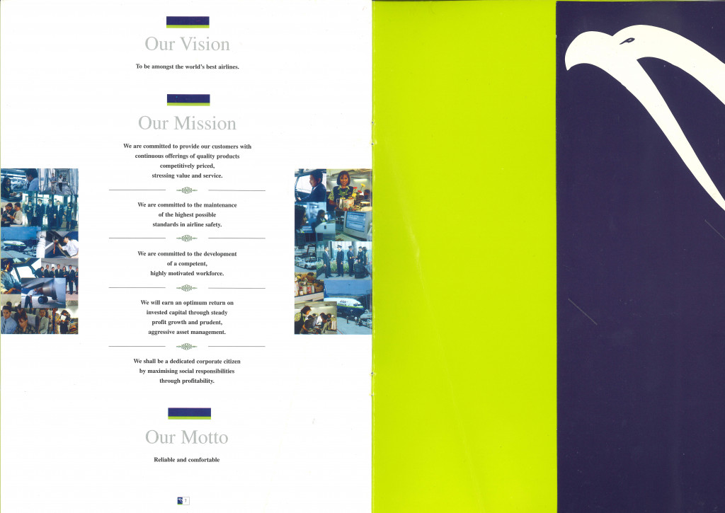
Not many people remember this, but before AirAsia was bought over and rebranded, its original colours were not red. At DRB-HICOM*, AirAsia’s original colours were blue and green, with a white eagle.
Here, former corporate communications manager Joyce Lai retells the story:
However, it was not until 6 January 2002, when our 3rd Boeing 737-300 flew from the US into the Sultan Abdul Aziz Shah Airport in Subang that our new red logo and livery were spotted.
The process of rebranding began in the small office at Tune Air, on the 17th floor of MUI Plaza (now renamed as Menara Hap Seng). A few of the team sat with Raymond, our in-house graphic designer, to discuss and play around with colour schemes of orange and blue – colours of the Tune Air logo then. Several drafts of the logo, font, and livery were presented to Tony – of which none was approved!
Tony asked, “Why do we need a ‘logo’ and a ‘word’ to be on the logo?”
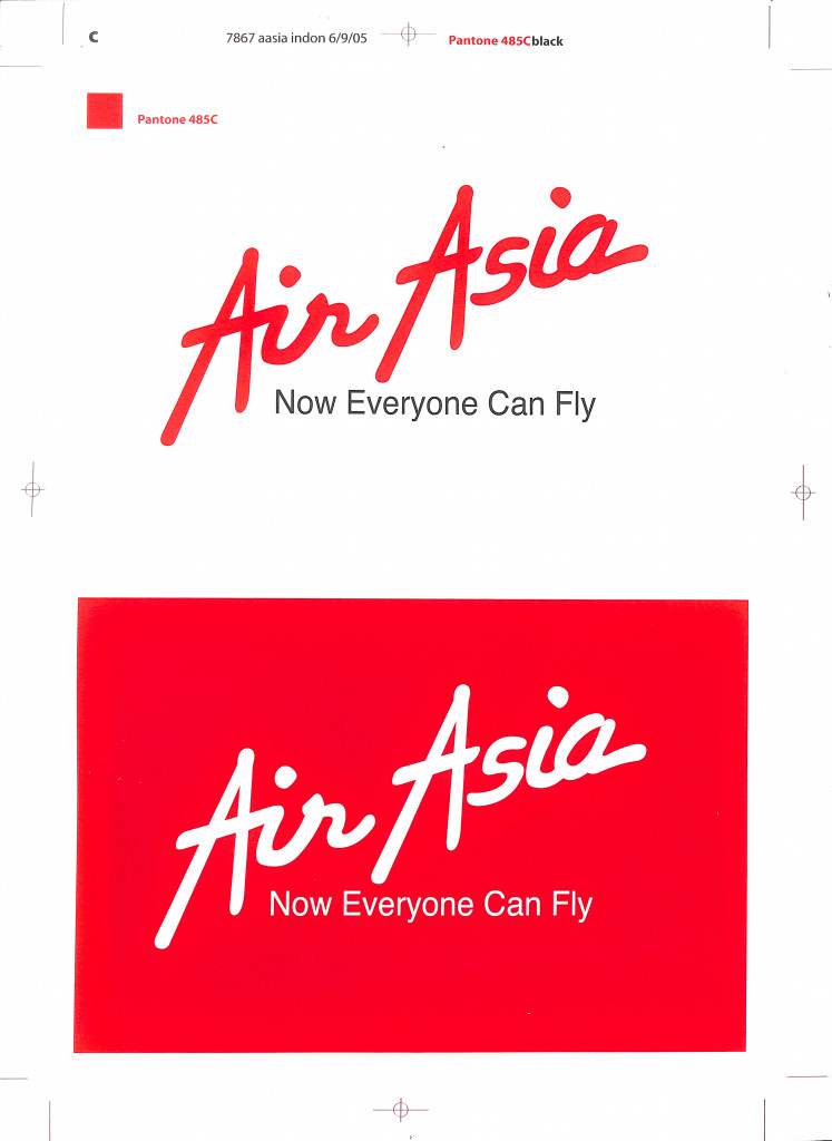
So, it was back to the drawing board. During the process, the team also tried looking at some of the big brands and their colours. The colour that stood out was red.
At first, Tony was hesitant about using red, as it may seem too similar to Virgin Airlines, owned by Richard Branson, Tony’s former boss. However, the team felt that red most represented their vision for the airline. Finally, a red wordmark, in a new font, and a red tail – symbolising the birth of a bold, vibrant, and passionate brand revolutionising air travel in Asia was born.
*Note: At DRB-HICOM, AirAsia’s original colours were blue and green, with a white eagle and our call sign was Asian Express. From 0001 MYT Malaysia Standard Time 16 November 2014, our call sign was changed to ‘Red Cap’.
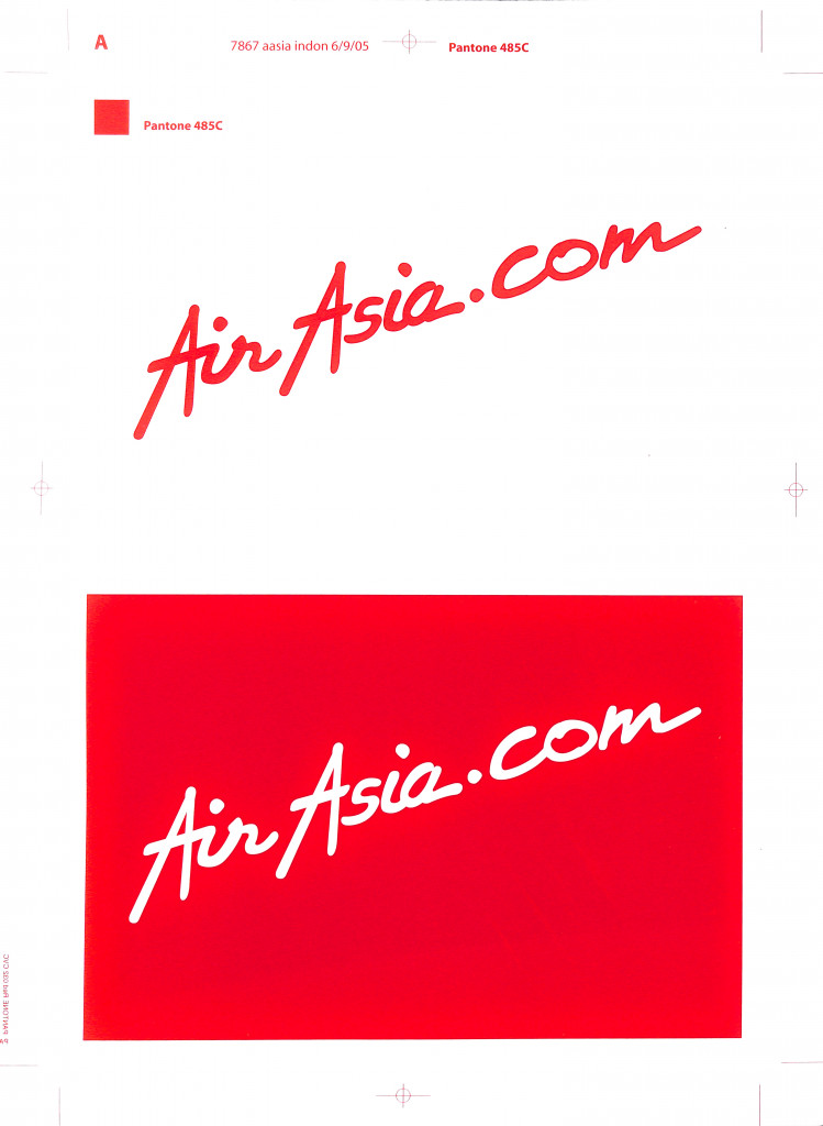
In 2020, we introduced a new brand identity for airasia.com as the Asean super app, completing our transformation from a digital airline into a comprehensive lifestyle platform and marking a new era for AirAsia. Watch on to find out more about how it all started, and where we’re headed next.